Sunday, 16 May 2010

dark black and white set

i have now chosen all the images that i want to appear in my set, i just need to decide on wich two i am taking out. i thought that it wouldnt do any harm to edit a few extra onse and just not submit the two i dont want.
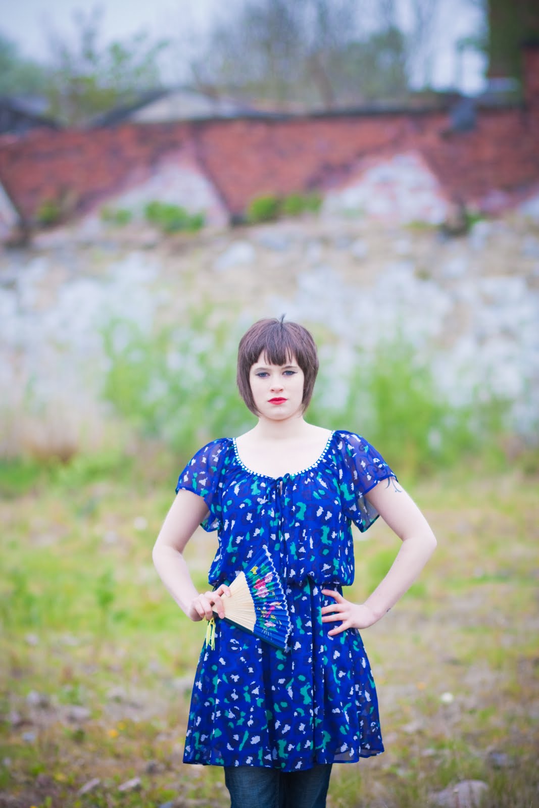
i have not yet decided on the editing of my iames yet so i have created several sets and edited them all differently and will later decide wich one i will submit.

i like the dark look of this set and how it dosnt have an obvious look to a spacific time. i know that i had my heart set on my images looking colourful but i will not be so stubourn as to not allow my images to lack colour even if they may look better.


Saturday, 15 May 2010

here are some more potential final images, i am still playing with the editing on these and just wanted to show a few different looks and ideas.
all of theses images fit in with some of the other images i have already edited and would easily fit into a set with them. i dont like all the edits but i will now begin to put them together as sets to show how they will look together as these styles.


Friday, 14 May 2010

here is another opetion for my final images. i want to crop it and edit it differently but i really like this one alot. i will spend more time on this one.


shooting with becky

i realise that this is the same location as the shoot for sarah but this is because i shot both these models at the same time and wanted to try both in some of the same locations. however i will only be using one of these models in my final images and i really liked the location and didnt see a reason why i should have the same background for both models so i am not worried about the same location popping up twice on my blog.


i really like the colour and tone here, i also find the models face to be be attractive and her strange body posisioning to be very interesting. the black and white colouring suits this image well.
i brightened up this image and i think it is really striking like this........


i gave this one a softer look and i think that its much nicer. with the model with her hand to her face this image definetly needs a softer look to it.

i realise that i am adding allot of images here that look the same as each other but i want to be sure that i tried this from every angle.
i think i prefer this image to the previous one. it is a better photograph of the model and there is enough of the old factory roof to add interest.


i like the warm look this one has, i may want to make a set for this one. i need to spend a little more time with this style of editing.

i added a desaturated look here and i think that it suits the image. i think that this is my favourite of these edits.

here i tried something different. i think that it looks nice but i don't think that it has a place in my work. i will keep it for my own personal work though.


i dont like these images as much as i did when i began to edit them, i wanted to show as much of the old factory roof as possible but its not one of the best images of the model.


here i tired to bring out the blue in the dress. i like the paleness of her skin.
here i like the greens in the background and how they sraw you in almost as much as the model herself.


i wanted to try somthing different for this one. it isnt very fitting but i like the look, i may put a set together for this one.

shooting with sarah

this is one of my favourite shots of the shoot, there is something about the look on the models face that i really like. i also like the tattoo that she has. i was not expecting the model to have such a large tattoo, it was too large to cover up but i actually really like it, i think it really adds to the modern look i want for the geisha's and it makes the model stand out to me. it adds a point of interest and i will be using this model again in the future.

i like the colours of this image, i just wanted to bring out the different colours that were there and allow the viewer to see the beauty within the image.

i took this one a little further with the editing, it could be to harsh. i think i will be looking for a second opinion here.

i like the tones here. it dose not fit in with the geisha look really as it lacks the vibrant colour so i don't think i can use it. i do really love it though.


i love the colour in this one, i think i may like green a little too much. i think I'm going to put this one into a set and see how it looks.